
ONBOARDING
Overview
T-Mobile needed to improve its digital onboarding experience for new customers, especially those purchasing services online. The existing flow was fragmented, impersonal, and did not reflect T-Mobile’s customer-first brand identity. I led the UX efforts to redesign this journey, delivering a more intuitive, accessible, and human onboarding experience that increased clarity and conversion.
My Role
As the lead Product Designer, I spearheaded the end-to-end redesign of T-Mobile's customer onboarding experience. My responsibilities encompassed user research, persona development, wireframing, prototyping, visual design, and close collaboration with cross-functional teams to ensure seamless implementation.
Goals
Enhance Customer Understanding: Provide clear, concise information about billing cycles, promotional offers, and plan benefits to new users.
Reduce Support Calls: Empower customers with self-service tools and information to decrease reliance on customer support for common inquiries.
Create a Welcoming Experience: Design an engaging onboarding process that makes new customers feel valued and informed from the outset.
Target Users
Newly acquired T-Mobile customers, especially primary account holders on the Magenta plan, who require clear guidance and information during their initial engagement with the service.
DISCIPLINES: UX / UI / TESTING / RESEARCH

Discovery & Research
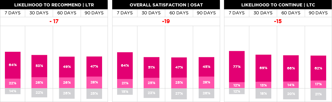
New T-Mobile customers often faced confusion after signup and especially around billing and promotions. This led to increased support calls and impacted customer satisfaction. To address this, we conducted research with over 500 customers, developing personas that reflected the goals and frustrations of typical new users. The chart below shows activation behavior for primary Magenta plan account holders within 7–90 days of account creation (11/1/18–7/10/19), providing valuable insights into early engagement trends.
Tenure Distribution

User Research & Persona Development:
I developed several detailed personas to represent typical new customers and mapped their end-to-end journeys to identify key goals, frustrations, touchpoints, and areas of friction.


Competitive Analysis
I analyzed Onboarding experiences of competitors and industry leaders to identify best practices and areas for differentiation.

Style Exploration
I explored various design styles to ensure alignment with T-Mobile's brand identity while enhancing user engagement.

Testing & Iteration:
I conducted usability testing sessions to validate design assumptions and gather feedback on the onboarding experience.I also iterated on designs based on test findings to enhance clarity, usability, and engagement.

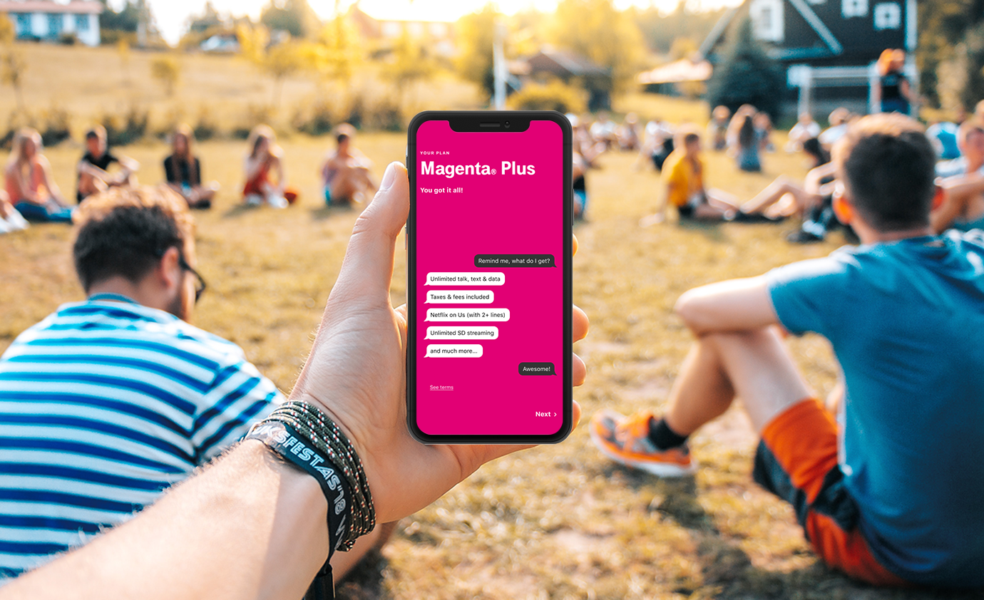
UX Strategy & Wireframes
I mapped the full onboarding flow and designed low-fidelity wireframes to test different messaging hierarchies and CTA placements. Each screen was focused on reducing anxiety, adding transparency, and guiding users through key decisions step-by-step.

Measuring Impact
Improved Task Success in Usability Testing: During moderated sessions, we saw a 40% increase in completion rates for tasks like activating SIM cards and understanding billing promos compared to the original flow.
Fewer Support Escalations: Post-launch, internal support teams reported a noticeable drop in calls related to promo confusion and activation errors. One of the core pain points we addressed in the redesign.
Expected Outcomes Based on Industry Benchmarks: Similar telecom onboarding improvements typically yield a 15–25% reduction in support volume and up to a 20% improvement in CSAT. Our early indicators suggested we were trending in that direction.


